Regardless of whether you believe in “learning styles” (almost all of the research debunks them), it still stands that a huge percentage of our learning is visual. This is especially true for eLearning. Think about it; when we’re engaging with eLearning courses or games we’re looking around, we’re reading, we’re clicking on things—we use our eyes a lot. So if our eyes guide us through so much of our eLearning, then why would you skimp out on the graphics?

All too often you find unrelated stock photography, huge chunks of text in awkward places, and mismatched color schemes in eLearning courses. It could be because the instructional designer is excellent at making great learning, but doesn’t know anything about graphic design. It could be that it takes time or money that one or more parties can’t justify spending. It could be a number of things, but the point is simple: it shouldn’t happen. If you’re going to spend all this money on an eLearning course or game, then you need that course to be as engaging and memorable as possible—and the graphics are one of your most valuable tools on that front.
Let’s talk to an actual graphic designer
Matt Kroeger is a Multimedia Developer here at Bottom-Line Performance. In his time here, he has produced quite the portfolio of awesome eLearning graphics. Graduating from Xavier University with a B.A. in Fine Art, he knows a thing or two about great visual aesthetics, so I decided to ask him a few questions about why this is so important… and how other Instructional Designers can make the best graphics possible.
As a designer, why do you think good graphics are so important in learning courses?
I feel like there are always going to be learners who will absorb material more effectively through clear imagery than anything else, but also more generally, sometimes the best graphics are the ones you don’t even notice like a simple UI or good spacing. Bad graphics are distracting and can be a detriment to learning. Plus, if you can combine really great learning design with a well-crafted visual theme, the course will be really memorable.
What is your favorite example of eLearning graphics that you created for a course or game?
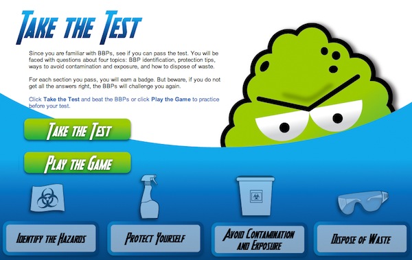
I would say my favorite project I have worked on from a graphics perspective would be what we did for this BBP course. It was a gamified course to begin with, which is fun in itself, but I also got to play around with non-standard fonts and colors too. I created illustrations for the environments the “characters” existed in, and then we used photos for real people. My favorite part was creating the illustrated germ characters that were the villains throughout the course.

What are some tips you have for anyone looking to start upgrading their visuals?
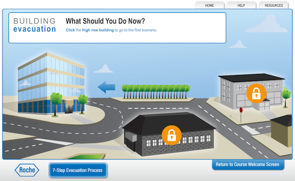
Learn Illustrator (only partially kidding!). Aside from that… The visual component of any course works hand-in-hand with the learning component. Sometimes learning designers get in the habit of conceptualizing “text and next” courses and then want to just slap a stock image on the screen. This isn’t the most exciting visual, but sometimes it’s one of the only options for that screen based on the amount of text. However, when the learning designer and graphic designer work together on an idea, you can get powerful results. From a static visuals perspective, I think the best way to upgrade your graphics is to try to be as efficient as possible with the text on the screen. Otherwise, you won’t have as much wiggle room to even begin to think about upgrading your graphics. Once you have found a balance where the graphics can truly complement the text, then you can start playing around with different illustration techniques and photo collaging. Adobe Illustrator and Photoshop are extremely useful tools for creating a variety of visuals.
In your opinion/experience, what are some of the big faux pas you’ve encountered in eLearning visuals that you might caution designers against?
I would avoid putting too much text on any one screen. In a lot of ways, one graphic can communicate several lines of text for you, so try to avoid stuffing too much in one place. I also am not a fan of stock photography when it doesn’t serve a meaningful purpose. However, I also know that not all illustrations are successful. Sometimes illustrations miss the mark when it comes to knowing the target audience, or they are crafted sloppily, or they don’t convey the point as successfully as you’d hoped. You have to strike the right balance. But whatever you choose to do, stick with that style throughout the course. Try to avoid mixing and matching unless you have a solid plan to do so.
Do you have any resources/websites you’d like to recommend?
For inspiration, Commarts is great for a range… so is Abduzeebo. But I really think you get the most inspiration by just keeping your eyes open and seeing what other people are doing, especially outside of the eLearning business. As for tutorials, Lynda.com is always good. I usually just google “how to [fill in problem here]” if i want to find out how to do something specific. Starting out with any of these programs, the best thing to do is to just start playing.
Some key takeaways and best practices
In Ruth Clark’s feature, More Than Just Eye Candy, she mentions a phrase coined by her colleague Frank Nguyen of Intel: “A Wall of Words.” You can probably guess the problem it is describing. Some instructional designers or trainers are stuck with huge amounts of copy (either because it was decided on by a committee and everyone threw something in, or they refuse to let anyone trim it down, or any number of things) and they just slap all of that copy onto a page. The second the learner sees all of those long paragraphs, you start to lose them.
On the opposite end of the spectrum, you can also have too many graphics, or have totally unrelated visuals that distract from the message. Clark states in her article, “Elaborate visual treatments unrelated to the goals of the instruction, while well intended, have been shown in controlled research studies to depress learning.” It’s just like Matt mentioned in the interview; you have to strike the right balance. Just always make sure your visual elements are relevant to the learning—or the user interaction (e.g. clean fonts, great looking menus and content boxes, planned color schemes).
I think Matt put it best when he said, “But whatever you choose to do, stick with that style throughout the course. Try to avoid mixing and matching unless you have a solid plan to do so.” Nothing is more distracting—and, honestly, discrediting—than a hodgepodge of random stock photography and random colors. Creating a style guide beforehand can make all the difference in your eLearning course, making it look more professional and more engaging.

Another best practice when it comes to eLearning graphics is efficiency. I mentioned earlier that a daunting amount of time and effort could cause people to settle for mediocre graphics. If you take the time to learn some quick tips and tricks about Photoshop and Illustrator, you can avoid that scenario. There are so many free tutorials out there to teach you how to cut images out of their backgrounds (and make it look natural), how to use fonts to your advantage, how to best lay out information, how to [fill in the blank]. If you optimize your workflow, and make it so that editing graphics takes minutes instead of hours, a new world of aesthetics opens up for your eLearning courses.
take your eLearning Graphics seriously
The point of all this is that, as Ruth Clark’s article title blatantly states, graphics are more than just eye candy in an eLearning course. Make a conscious effort to improve the visual quality of your eLearning and avoid the Wall of Words, but don’t just throw irrelevant stock photography in because you read online that you needed more visuals. At Bottom-Line Performance, we have hire awesome designers for our Multimedia team because we recognize the value of visuals in our eLearning courses. The tag-team of solid instructional design and engaging visuals is always going to produce the best results.
If you need to create custom eLearning with highly engaging visuals, we’d love to chat.


very good article Jake, and agree with all the points made, eye strain gets induced fairly quickly when trying to read too much text on screen and less is more is a decent step forward. I also think that users should really strive to create elearning objects and library graphics i.e. standard images, templates etc to both save time and ensure consistency of look/feel. enjoyed it.
good article, i’m also a graphic designer who produces e-learning, mostly in Lectora and Flash. I value a lot the graphics, hate the wall of text, and always try to have an impact on the user, that’s the most important part. I hate when the users just clic on the arrows and don’t learn anything